


Carisma Seguros
An insurance broker trading since 2014, with a client book built on relationships. The brand had to show that without slipping into the cold, corporate look of the sector.

Insurance sells
on trust, not on fear.
Carisma has a stated mission: security, trust and financial protection, through ethical broking. The values that guide it are client focus, ethics, resilience, results and innovation.
None of that showed in the old brand. What showed was the sector.
- A brand indistinguishable from the insurers it represents
- No symbol of its own with meaning
- Materials with no system between them
- Communication built on fear, not on care
A shield that is
also an embrace.

Protection and care in one shape
The symbol brings together the idea of a shield (protection) and a figure that welcomes. It is the link between what insurance does and the way Carisma treats the people who take it out.
- Standalone symbol and full signature
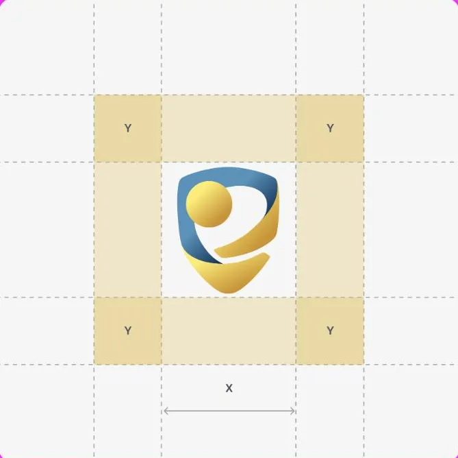
- Construction and clear space defined
- Versions for light, dark and monochrome

Base blue, gold for value
The blue keeps the read of the sector, which is useful here; the gold takes away its coldness and gives it worth. The two colours in a gradient form the visual signature of the symbol.
- Two main colours in a gradient
- Neutral for text areas
- Rules for photographic backgrounds

From the office to Instagram
We defined patterns and templates so the brand stays consistent in the office window, on documents and on social, which is where the sector usually loses its coherence.
- Patterns for backgrounds and materials
- Templates for posts
- Applied to documents and signage

The brand in four backgrounds.
An insurance symbol gets applied everywhere: documents, shop window, social, email. We defined the versions before anyone had to improvise one.
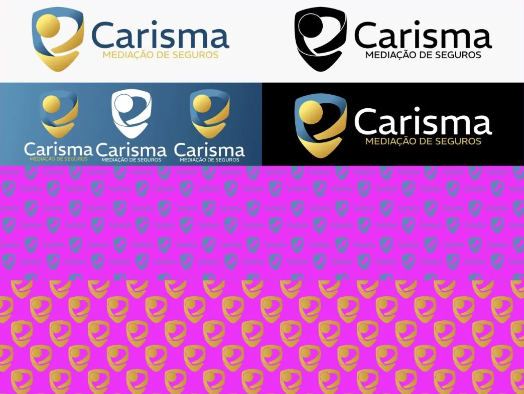
Colour, black, white and negative
Four approved versions for the backgrounds the brand meets day to day.
The symbol in repetition
Two patterns, one discreet and one bold, for backgrounds and materials.
The same brand everywhere
From the business card to the social post, with no improvised versions along the way.
Sector blue,
gold that stands apart.
Staying in blue was a decision, not a lack of nerve: in a sector built on trust, straying too far costs more than it gains. The difference is made in the gold and in the symbol.
What started happening.

- The brand gained meaning
- The symbol explains itself in one sentence, which makes life easier for whoever is selling.
- Applications with no improvising
- Every new piece starts from rules already written.
- Coherence between physical and digital
- The shop window, the documents and the social channels now speak the same language.
- Percentages
- We do not publish client numbers without written permission. The ones from this project are discussed on the call, with the data in front of us.
- Premium comparisons
- We do not publish price comparisons between insurers. That is done in the quote, with real data.
Another case of the same kind.


If your business is good
and stuck offline.
Thirty minutes about what you sell and how you measure. If we are not the right choice, we will tell you straight away.