

Villas Duma
Exclusive villas in Albufeira, with a personal service and guests who come back. What it lacked was a brand that said so before the first booking.

Great villas,
a brand with no voice.
Villas Duma manages holiday properties in the Algarve with a level of care you notice during the stay: full support, hand-picked houses, guests who recommend it.
Online, it was competing with hundreds of identical listings, the same photos, the same copy, no brand behind them.
- No symbol or palette of its own
- Communication indistinguishable from any listing-site advert
- Every post with a different look
- Nothing tying the brand to the Algarve
One sun, two waves
and one rule for everything.
The Algarve reduced to two shapes
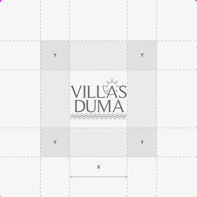
The sun and the waves, the sunlit experience of being in the Algarve, drawn with the bare minimum. The typography sits alongside the symbol so it works as a stamp, in a footer and in an Instagram square.
- Symbol in stamp and horizontal versions
- Defined clear space
- Versions for light and dark backgrounds

Water blue, beach sand
A deep blue for the base, a sandy gold for the accent and a light turquoise to breathe. Colours that already exist in the photographs of the houses, so brand and photography do not clash.
- Three colours, clear hierarchy
- Tested over real photography
- Contrast checked for text

A system of posts, not one-off posts
We set templates for the kinds of content the brand always posts: presenting the house, the details, the surroundings, the call to book. Each one with the same structure, so it is recognisable without reading the name.
- Templates by content type
- Captions with a fixed structure
- A discreet watermark on every piece
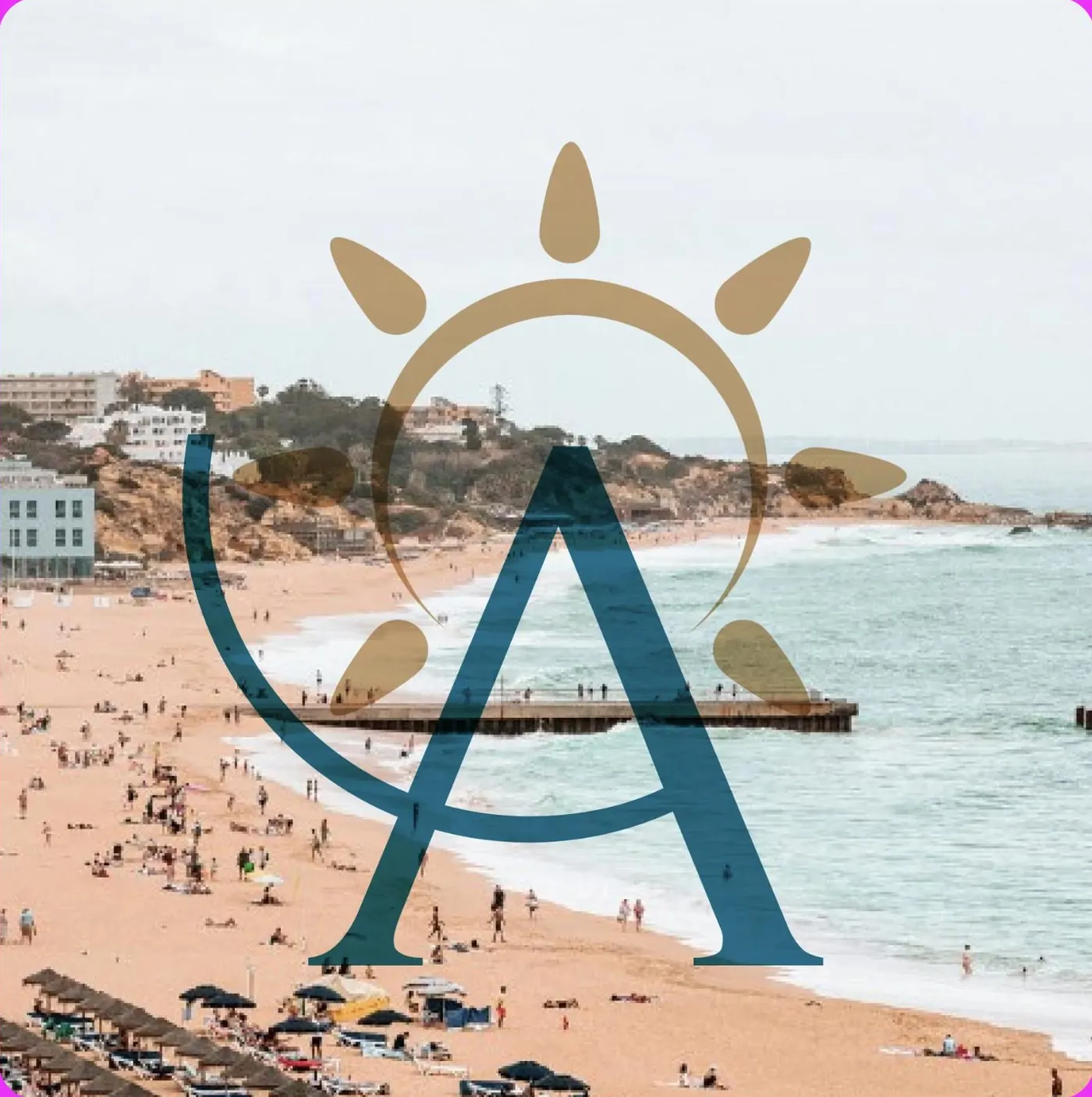
The brand at work.
An identity only exists when it survives daily use. These are the templates the team uses to post without having to decide everything again for each post.

The house, in three lines
Each villa comes in with its location, what it offers and how many people it sleeps, always in the same order.
What you see in person
Pool, kitchen, garden, snooker. The details that settle a booking, shown one by one.
The booking, straight to the point
The last post in each series is always a direct invitation, with the season and the reason.
A stamp of sun,
water beneath.
The palette and typography were chosen to stand up to what the sector demands: strong photography behind, small text on top, screens of every size.
What started happening.

- The brand became recognisable
- The symbol registers before the name, which is the goal of any identity.
- Publishing stopped meaning deciding
- With templates in place, the team produces without stopping to design.
- A language for the Algarve
- The brand stopped looking like a listing-site advert and started looking like a host.
- Percentages
- We do not publish client numbers without written permission. The ones from this project are discussed on the call, with the data in front of us.
- Bookings
- Bookings depend on season, price and platform. An identity helps people choose. It does not replace the operation.
Another case of the same kind.

If your business is good
and stuck offline.
Thirty minutes about what you sell and how you measure. If we are not the right choice, we will tell you straight away.
The brand put to work every day.
With the identity done, we took on the operation: planning, producing and publishing. This is where a brand stops being a file and becomes a habit.
Every villa presented the same way
Location, capacity and what it offers, always in the same order, so comparing is easy.
What settles the booking
Pool, kitchen, garden, snooker. The details that make people choose one house over another.
A reason to book now
New Year, summer, a long weekend. The call changes with the calendar, the structure does not.