
Helena Fernandes
Two decades in the trade, a salon and a programme that teaches other hairdressers how to run their business. One person, two roles, and a single brand.

One person,
two businesses.
Helena has been a hairdresser for more than twenty years and founded VisionHair, a programme that helps professionals run their own business. They are two things with different audiences: people booking at the salon and people signing up for the training.
With no brand tying the two together, each one lived on its own.
- Salon and training with no visual link
- No symbol to stand for the authority she had built
- Materials made case by case
- Local competitors all looking alike
Scissors, a crown
and an infinity.

Three meanings in a single design
The scissors for the craft, the crown for excellence and the infinity for continual growth. Together they form a monogram that works just as well on the salon door as on the cover of a training programme.
- Standalone symbol and full signature
- Versions for light, dark and gold
- Legible in embroidery and engraving

Salon burgundy, gold for merit
A deep burgundy as the base and a warm gold for the accent, over cream. Colours that speak of care and status without falling into the sector’s generic black and gold.
- Three main combinations
- Applied over tested photography
- Contrast rules for text

The brand filling space
Two patterns derived from the symbol, one with the monogram, one with the scissors, for backgrounds, packaging and print. It is what carries continuity when the logo does not fit.
- Two patterns with defined scales
- Applied to the portfolio and cards
- A discreet version for photo backgrounds
The brand across four backgrounds.
A personal brand shows up in many places at once: the shopfront, Instagram, a training manual, a business card. We defined every combination so that none of them looks improvised.
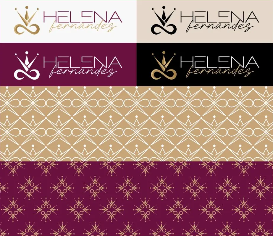
Light, cream, burgundy and black
Four approved backgrounds, each with the right version of the symbol. No hesitation when it comes to applying it.
The symbol in repetition
Two patterns that fill space without competing, one gold, one burgundy.
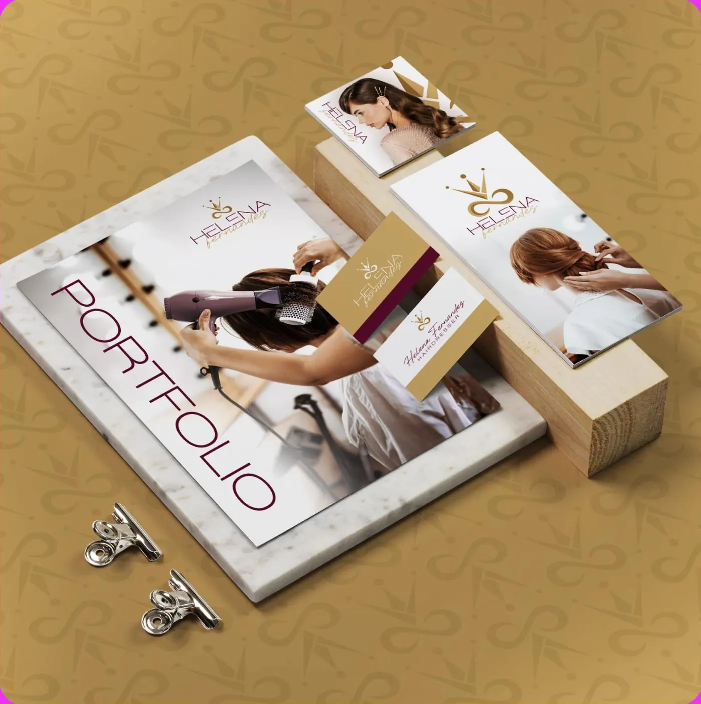
From the portfolio to the card
The brand delivered and applied across the materials Helena uses with clients and trainees.
Salon burgundy,
gold for merit.
The values were taken from the brand in real use. We confirm the official hex codes before publishing.
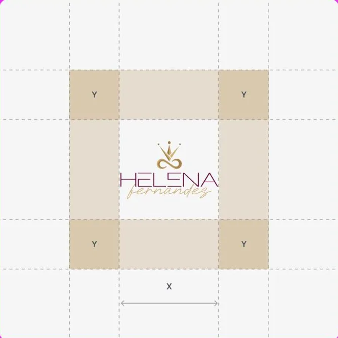
What started happening.

- Salon and training became the same brand
- One symbol that serves both roles without needing two logos.
- Materials stopped being improvised
- Every new piece starts from rules already set.
- Visible authority
- The crown and the infinity say in silence what would take a paragraph to explain.
- Percentages
- We do not publish client numbers without written permission. The ones from this project are discussed on the call, with the data in front of us.
Another case of the same kind.

If your business is good
and stuck offline.
Thirty minutes about what you sell and how you measure. If we are not the right choice, we will tell you straight away.