
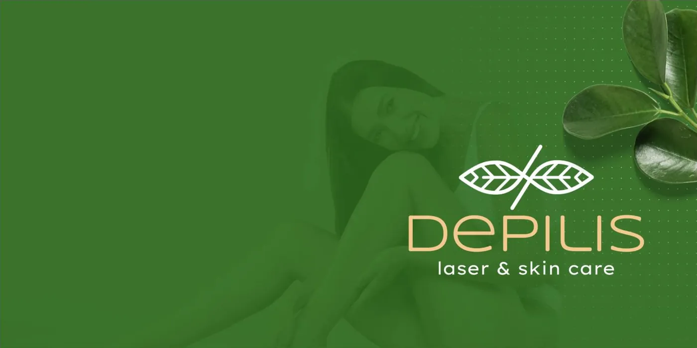
Depilis
A laser hair-removal service that sells to salons, pharmacies, gyms and barber shops, and needed a brand that worked just as well in B2B as in the shop window.
A technical service
with a human promise.
Depilis has a mission you can state in two lines: a caring, quality service that improves people's lives. The problem is that the sector talks in lasers, power and sessions.
The identity had to hold both: the technical rigour for the people buying the equipment, and the care for the people lying on the treatment couch.
- A sector spoken of through technical specifications
- No symbol of its own and no applications system
- Two audiences with different needs
- Each piece with a different look
An open infinity,
two leaves.
The most meaning in the fewest strokes
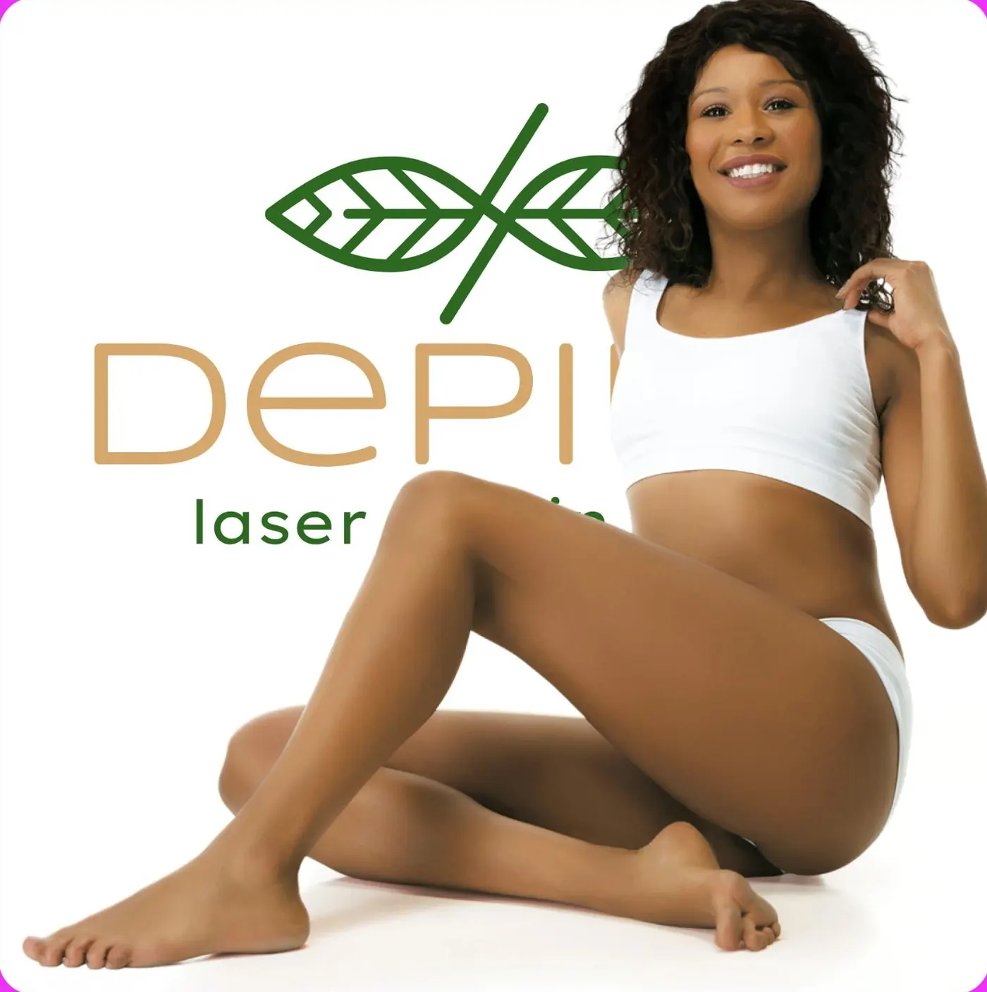
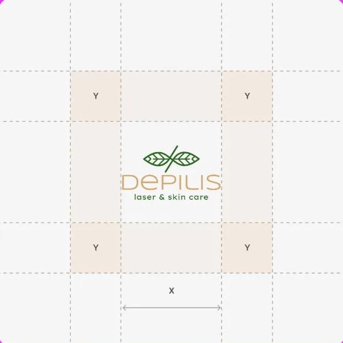
Hair never stops growing, hence the infinity, but open, to show that the cycle can be broken. The leaves bring in the natural, caring side of the treatment. A symbol you can explain in two sentences.
- Primary version, horizontal and badge
- Works for embroidery and engraving
- Legible from 12 mm
Green that calms, tan that warms
A deep green as the base, a warm tan for the accent and a cream to let it breathe. No pink, no shimmer, the opposite of what the sector usually does.
- Five validated combinations
- Tested on uniform, card and screen
- Contrast checked for text
From the uniform to the business card
We handed over the brand already applied where it lives: a uniform with the pattern across the back, cards, packaging and shop-window materials. Without this, an identity stays stuck in the file.
- Uniform with its own pattern
- Cards and printed materials
- Patterns for backgrounds and packaging
The brand across five backgrounds.
An identity has to survive the real world: the green uniform, the cream card, the bright shop window, the dark post. We defined each combination rather than leaving it to chance.
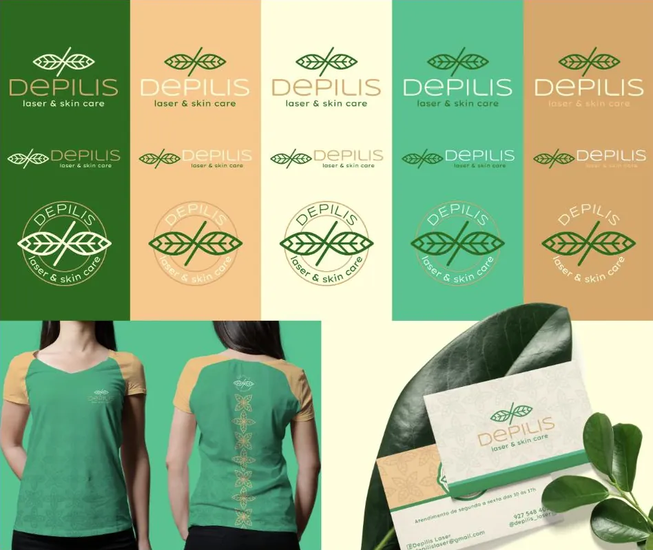
Three drawings, one symbol
Primary, horizontal and circular badge, to fit wherever it is needed without losing legibility.
The brand without the name
A pattern derived from the symbol, for uniform, packaging and backgrounds. It is recognised before it is read.
Ready to print
Cards, uniform and shop-window materials delivered applied, not just described.
Leaf green,
skin tan.
The palette steps away from clinical pink and luxury black. It sits somewhere of its own: natural, warm and grown-up.
What started happening.
- The symbol explains the service
- The open infinity tells the promise before any words.
- The brand reached the physical world
- Uniform, cards and shop window now speak the same language.
- A system, not a file
- Every application has a rule, which avoids improvising with each new piece.
- Percentages
- We do not publish client numbers without written permission. The ones from this project are discussed on the call, with the data in front of us.
- Treatment results
- We do not publish clinical promises or before-and-afters. That is the remit of whoever provides the service.
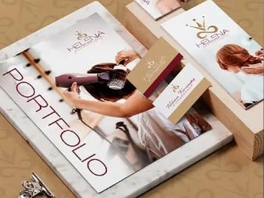
Another case of the same kind.
If your business is good
and stuck offline.
Thirty minutes about what you sell and how you measure. If we are not the right choice, we will tell you straight away.