


Ana Sofia
A personal-development specialist who works mainly with mothers, in the belief that guiding a mother means guiding what comes next.
Intimate work
needs a calm brand.
Ana Sofia supports mothers through personal growth. It is close, trust-based work, and the brand had to say so before the first conversation.
The sector is full of handwritten type and pink. That was not her.
- A sector that looks repetitive and childish
- No symbol to convey warmth
- Materials with no continuity between them
- A personal brand with no system
Circles that welcome,
half-moons that lift.
Warmth drawn with circles
Circles as the base, half-moons in combination: two shapes that embrace without overlapping. It reads as an embrace and as a rise, the two ideas at the centre of Ana Sofia’s work.
- Standalone symbol and signature
- Documented geometric construction
- Light and dark versions
Deep purple, warm gold
A dark purple for the base, serious, grown-up, far from the sector’s pink, with gold for the accent and a blue-grey for the resting areas.
- Three colours with defined roles
- Contrast checked
- Rules for photography behind it
The brand creating texture
The patterns use elements of the symbol itself, combined into textures that set the brand’s personality as a source of warmth and of rising.
- Patterns derived from the symbol
- Scales for background and for detail
- Applied across materials and social media
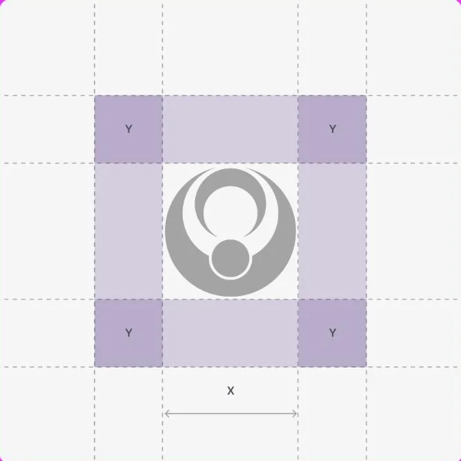
Building the symbol.
A symbol that explains itself is a symbol that holds up. These are the construction rules and the clear space that keep it consistent in any application.
Circles and half-moons
The build starts from simple shapes, which keeps the design stable at any size.
Space around it
The defined clear space stops the brand from being squeezed between other elements.
Texture with meaning
The patterns repeat elements of the symbol to create continuity without repeating the logo.
Purple that doesn’t patronise.
The most important choice was subtraction: no handwriting, no pink, no family illustrations. Just geometry and colour.
What started happening.

- The brand no longer looks like the sector
- It stands out in a market where almost everything sounds the same.
- A symbol that explains itself
- The geometry tells the promise (welcome and lift) without a line of text.
- A system instead of one-off pieces
- Patterns and rules make it possible to create new material without starting from scratch.
- Percentages
- We do not publish client numbers without written permission. The ones from this project are discussed on the call, with the data in front of us.
- Result promises
- Personal development is not measured in percentages, and we are not going to pretend it is.
Another case of the same kind.

If your business is good
and stuck offline.
Thirty minutes about what you sell and how you measure. If we are not the right choice, we will tell you straight away.
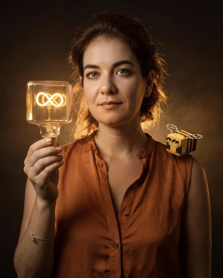
The brand speaking every day.
The identity gave her the shape; the socials gave her a voice. Content made for people with little time and a lot of guilt about not having it.
Questions that make you stop
“We all have 24 hours. How are you using yours?” The content opens with the question, not the solution.
Concrete swaps
Worry swapped for mindfulness, self-criticism for self-praise. Small changes, explained in a single image.
Ten-minute exercises
Short routines for people who don’t have an hour. Personal development is physical too.