

Guru Poupança
Branding is not a pretty logo. It is uncovering the identity of a business and telling it in a way that sticks. That is what we did here.

Saving is a subject
everyone avoids.
The finance sector all communicates the same way: blue, a tie, charts heading up and a language that pushes away the very people who most need to hear it.
Guru Poupança wanted to speak to the people who want to save and do not know where to start. That calls for a brand that does not intimidate.
- A sector where everything looks the same
- Technical language that drives away the right audience
- No character and no recognisable face
- Competition fought on price, not on value
Being the obvious choice,
not the cheapest.

A face instead of a logo
We created a character, the guru, that gives the subject a face and a sense of humour. A brand with a face is remembered and shared; an abstract symbol in the finance sector disappears among the rest.
- A character with expressions and poses
- A symbol that works without the character
- Versions for an avatar and for the top of a site

Yellow that draws you in, midnight blue that holds
A strong yellow for action and an almost-black blue for the base. It steps outside the sector’s institutional blue without losing credibility, just enough to be recognisable in a list of results.
- Two colours with defined roles
- Contrast checked for legibility
- Usage rules on light and dark backgrounds

Talking the way you would explain it to a friend
We set the tone: direct, with humour, no jargon that sends you to Google. The brand speaks with authority without sounding like it is selling.
- Tone-of-voice guide
- A list of what we never say
- Examples applied to real content

What the client
did not know they needed.
When we started, the brief was a logo. What was missing was something else, a reason to choose this brand over the cheapest one.

No longer competing on price
A brand that is distinctive and desirable is chosen on value. Anyone competing on price alone loses the day someone cheaper turns up.
Trust that builds loyalty
A strong brand turns the curious into people who recommend you. It is the foundation of a relationship that outlasts any campaign.
Being heard above the noise
A clear message, a consistent tone and a character people recognise, and selling stops feeling like selling.
Alert yellow,
vault blue.
The contrast is deliberate: the midnight blue gives the seriousness the subject demands, the yellow gives the energy the sector lacks.
A brand you can see.
A site that does the maths.
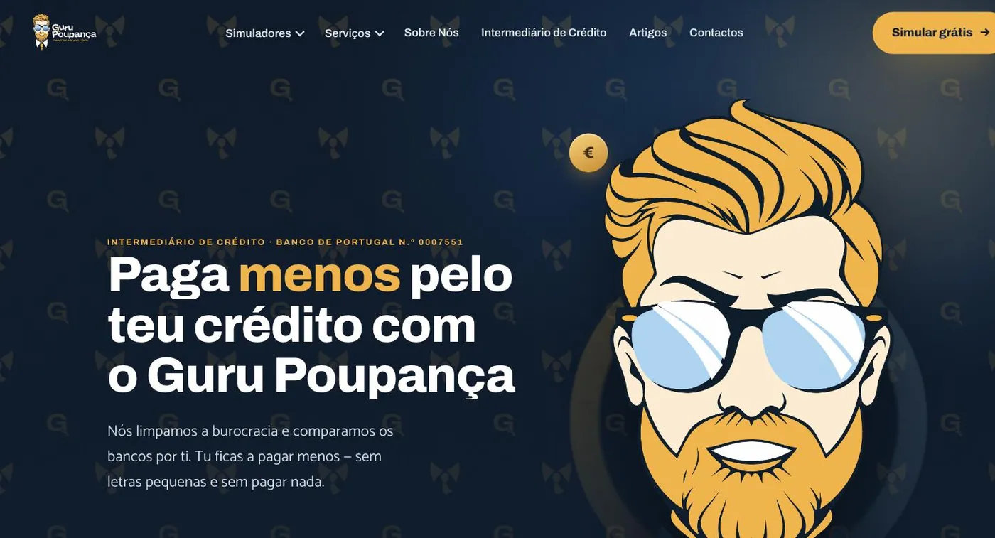
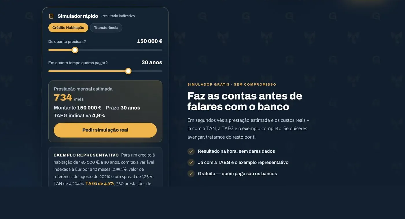
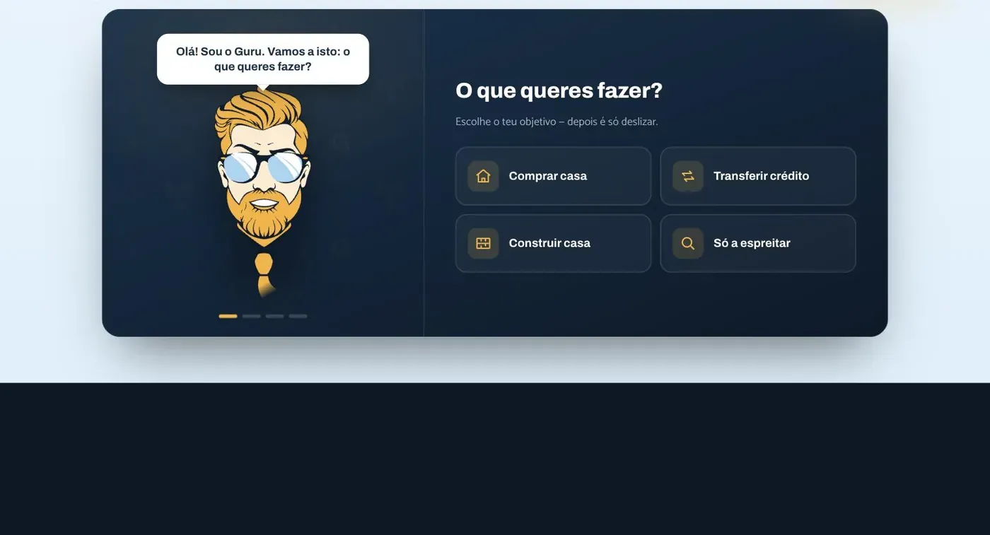
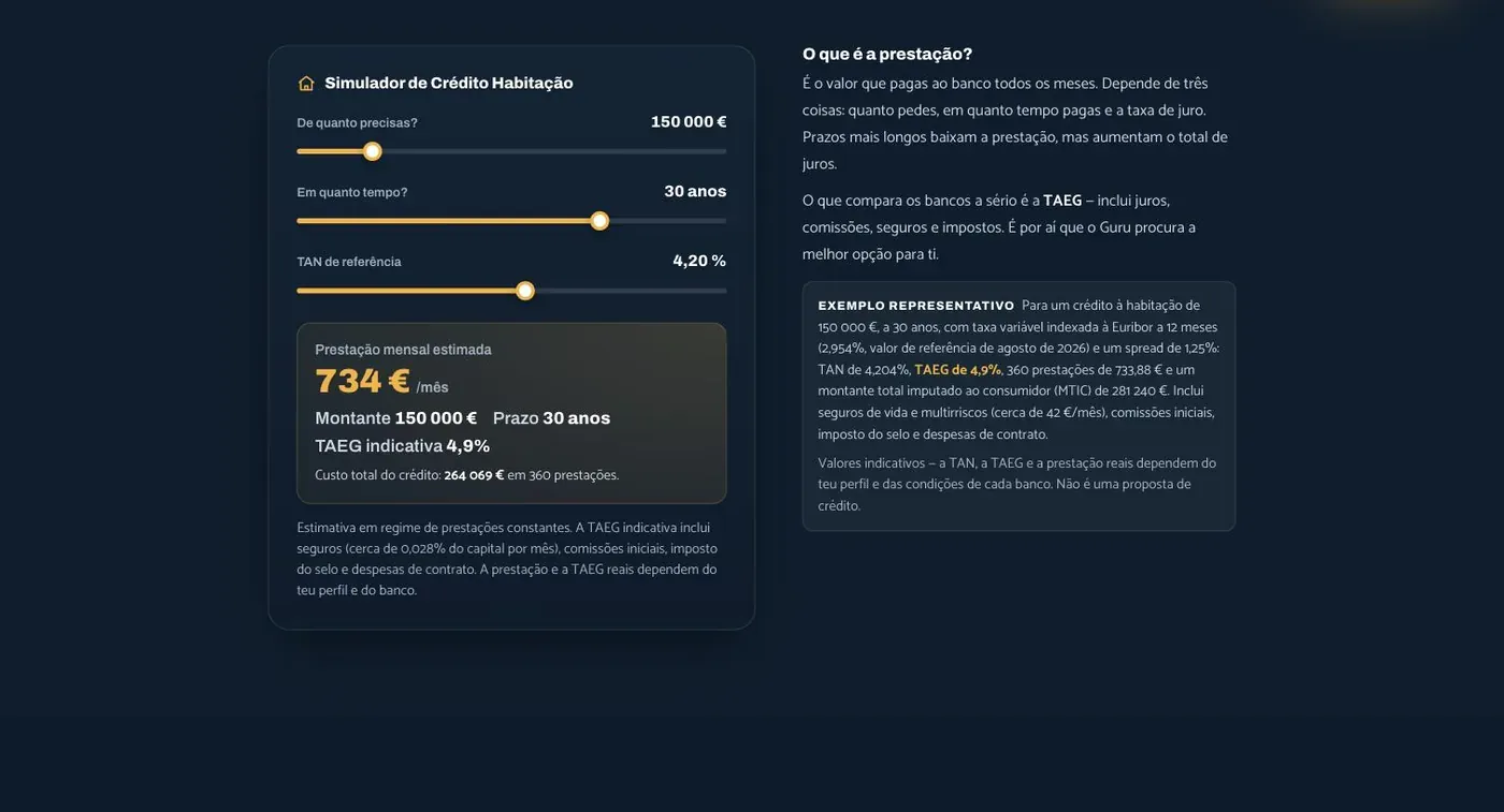
In 2026 the identity left the brand book and became a website: 23 pages, seven calculators, a game and the character always in sight. All with the rigour a firm supervised by Banco de Portugal requires.
What started happening.

- The brand now has a face
- The character became the recognisable element, adaptable to any format.
- A tone instead of improvisation
- Every piece of copy now has rules, what is said, how it is said and what is never written.
- Value before price
- The messaging now makes the case for what the brand does, not what it costs.
- Percentages
- We do not publish client numbers without written permission. The ones from this project are discussed on the call, with the data in front of us.
- Return promises
- We do not make, nor let the brand make, promises of returns. Financial education is not financial advice.
Another case of the same kind.


If your business is good
and stuck offline.
Thirty minutes about what you sell and how you measure. If we are not the right choice, we will tell you straight away.