

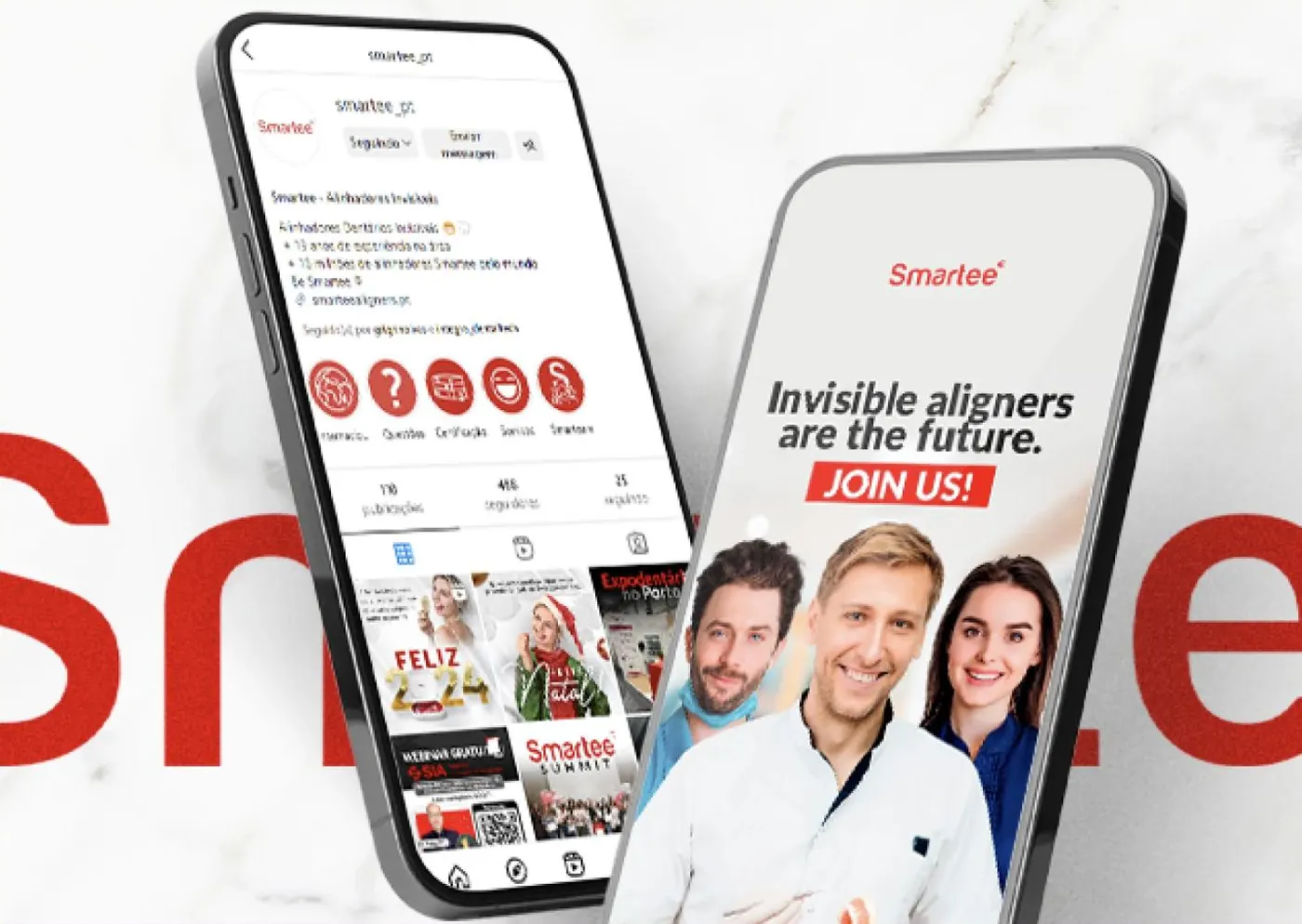
Smartee
An invisible-aligner brand with two audiences at once: the dentist who recommends and the patient who decides. Each one needs to hear something different.

Two audiences,
one single account.
Smartee sells aligners to clinics and is chosen by patients. The dentist wants to know about technology, training and margins; the patient wants to know whether it hurts, how much it costs and how long it takes.
Posting for only one of them leaves the other out, and the account is the same one.
- Clinical language pushing the patient away
- No separation between what is for the dentist and what is for the patient
- Events and campaigns announced at the last minute
- A grid with no identity of its own
Translating the clinical
without simplifying it.

Each piece knows who it is speaking to
We split the content between what is aimed at the clinic (training, technology, terms) and what is aimed at the patient. Same brand, two registers.
- Pillars by audience type
- Tone adjusted to each one
- Nothing published without a defined recipient

Language the patient understands
“Invisible aligners are the future” works better than a technical description. We translate what the brand does without losing rigour.
- Benefit before specification
- No promises of clinical results
- Real imagery of the product

Events and dates in advance
Open days, a presence at trade fairs, campaigns with a deadline. Each one communicated in good time and with the same visual system, so the brand stays recognisable amid the noise of the sector.
- A calendar of events and campaigns
- Pieces with the date and place clearly shown
- The same identity across every activity
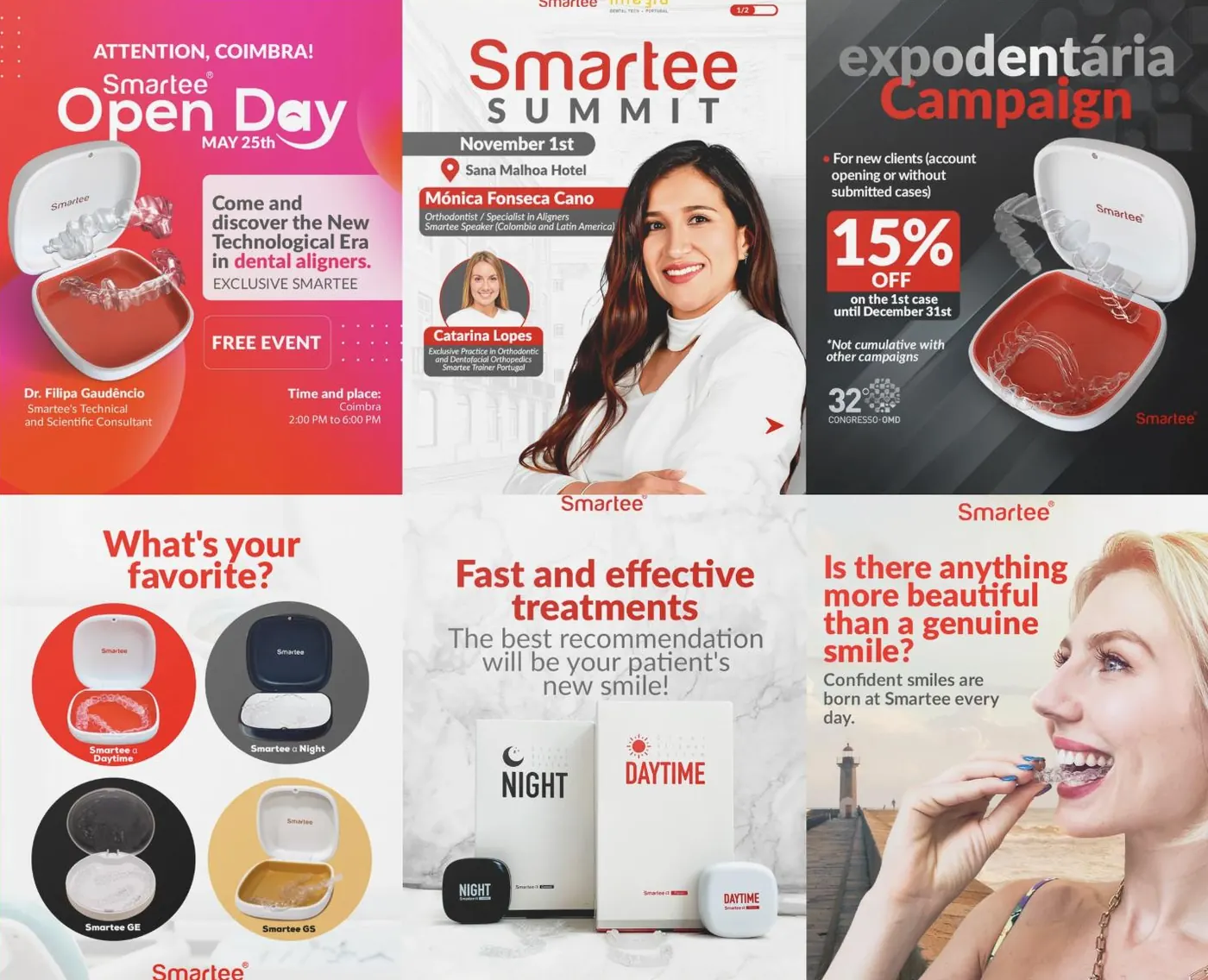
What we say to each one.
There is a single account, but it alternates between the people who recommend and the people who decide. These are the three types of piece and the audience for each one.
For the people who recommend
Training, industry events and commercial terms. Content aimed at those who have to trust the product before they propose it.
For the people who decide
What it is, how it works and why it is different from fixed braces, explained without technical terms.
For the people who are almost there
Open days, time-limited offers and a presence at trade fairs. The part that turns interest into a booking.
What started happening.

- Every piece has a recipient
- The account has stopped speaking to everyone at once.
- Events announced in good time
- They are no longer announced at the last minute, which changes turnout.
- A recognisable grid
- The red and the fixed structure make the brand stand out in a visually uniform sector.
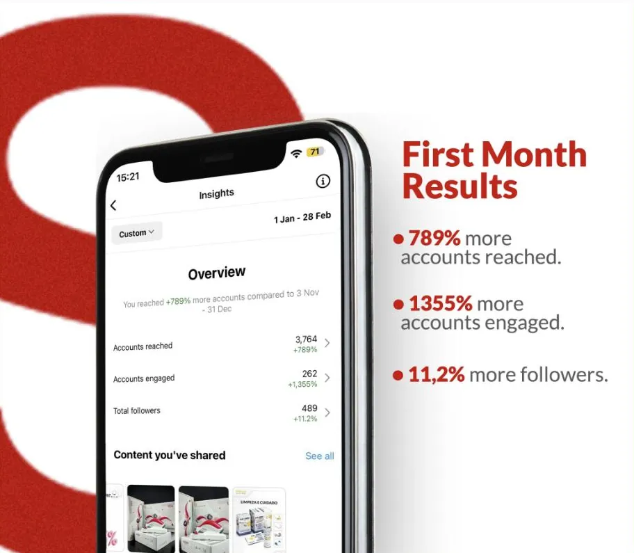
- Percentages without context
- When we publish numbers, we say what period they are from and on what basis. Launch percentages always look bigger than they are.
- Treatment outcomes
- We do not publish clinical promises or patient cases. That is the responsibility of whoever provides the treatment.
Another case of the same kind.


If your business is good
and stuck offline.
Thirty minutes about what you sell and how you measure. If we are not the right choice, we will tell you straight away.