OTTA
A natural-cosmetics brand in a market where everyone says “natural”. The job was to show what that means here, image by image.

Everyone says natural.
Few show why.
OTTA sells skincare with a natural base. The problem in the sector is that the word has lost its weight: it is all over the packaging and in every advert.
The difference had to show up in the image, in the light, the texture, the choices, before it showed up in the words.
- A category saturated with the same language
- Posts with no system between them
- No defined content pillars
- Captions that described instead of asking
Three pillars,
one grid you recognise.
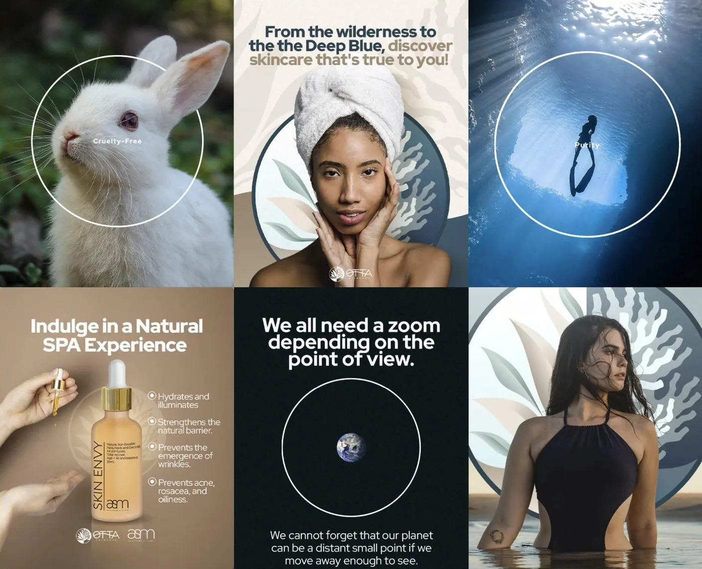
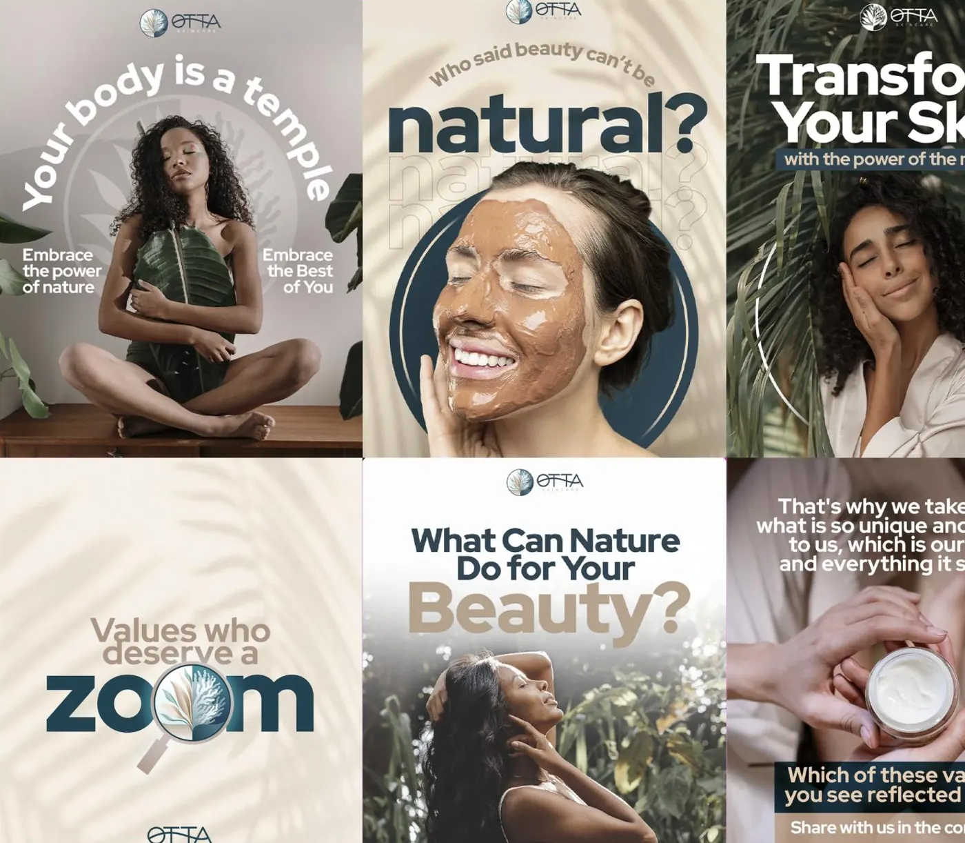
A visual system for the grid
Circles, sand and water tones, photography in natural light. Each piece is different, but the grid reads as a whole when someone opens the profile.
- Templates by content type
- A fixed palette of backgrounds
- The brand always in the same corner
Posting with intent, not by volume
We defined three pillars (nature, product and question) and a rhythm. Each post exists to do one thing, and you know which before it is produced.
- Defined content pillars
- A calendar with intent for each piece
- Nothing posted just to avoid missing a day
Captions that ask for a reply
Ending with a question is not a gimmick: it is the difference between a post that is seen and a post that is commented on. We write the captions to open a conversation, not to close the subject.
- A question at the end of each piece
- A consistent tone across posts
- Replying to comments as part of the work
What each piece does.
Posting every day with no system is noise. These are the three types of content the brand alternates, and the reason each one exists.
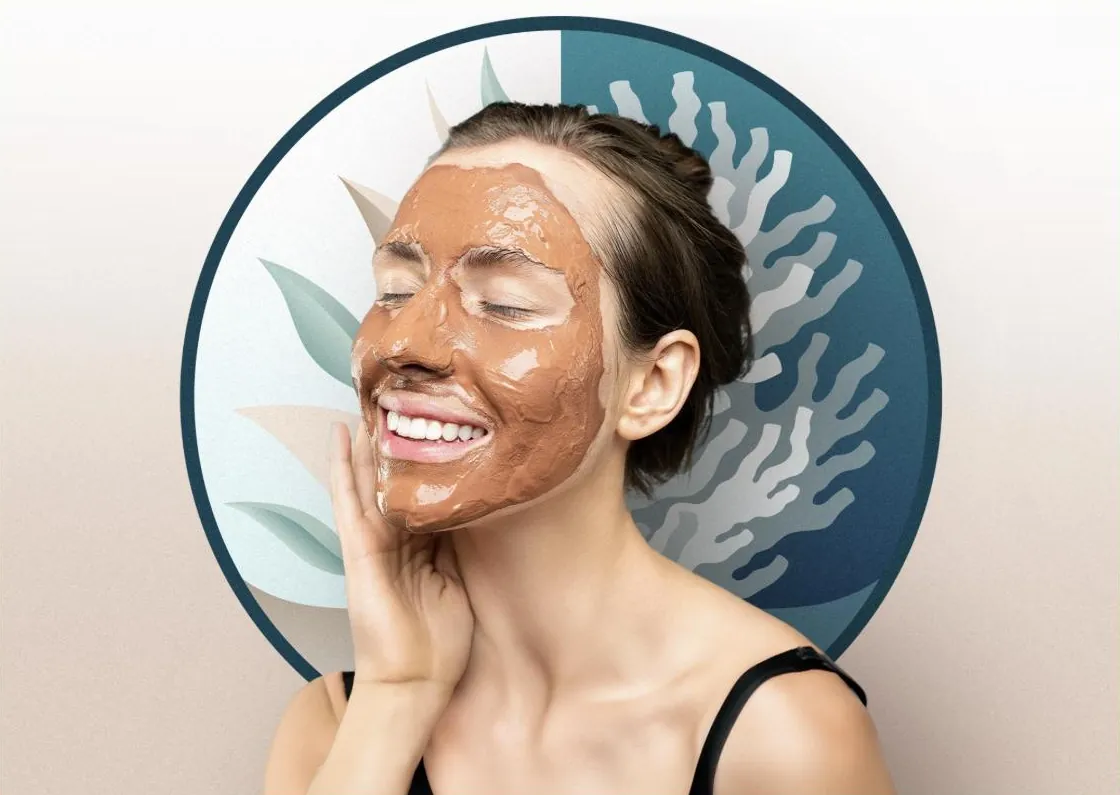
Where it comes from
The origin of the ingredients and why they are chosen. This is where the word natural gains substance.
What it does
The product with the benefit explained in short lines, with no list of chemicals and no medical promises.
To open a conversation
Pieces that end with a question to the audience, made to generate replies and not just reach.
What started happening.
- A profile that reads as a whole
- The grid now has an identity of its own, recognisable before the name.
- Posting is no longer improvised
- With pillars defined, each piece has a purpose before it is designed.
- A conversation instead of a monologue
- The captions now ask for a reply, which changes the kind of interaction the brand receives.
- Percentages without context
- When we publish numbers, we say what period they are from and on what basis. Launch percentages always look bigger than they are.
- Promises of results on the skin
- Cosmetics are not medicine. We do not publish before-and-afters or clinical promises.
Another case of the same kind.


If your business is good
and stuck offline.
Thirty minutes about what you sell and how you measure. If we are not the right choice, we will tell you straight away.