

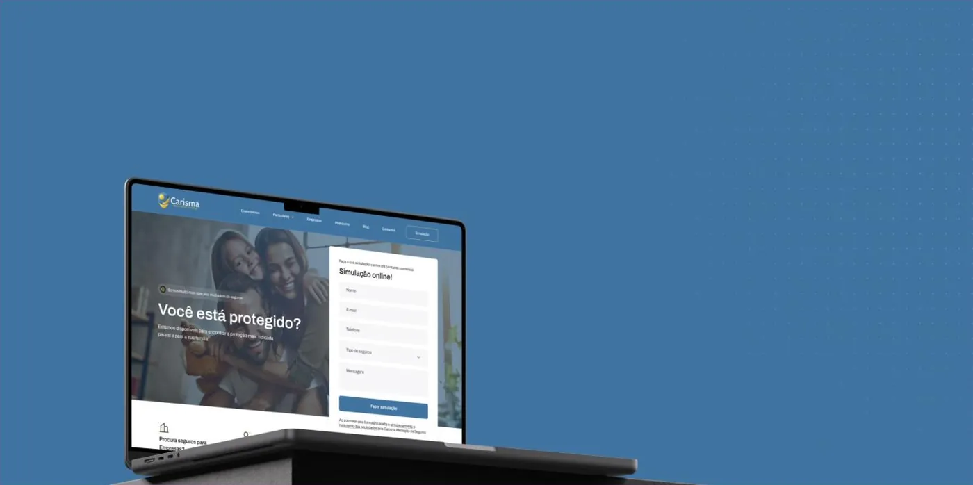
Carisma Seguros
An insurance broker in business since 2014, with a client base built on trust and a local presence. What it lacked was the same clarity online.

Insurance is badly explained.
This one had to explain itself well.
Carisma is an insurance broker with a simple promise: to find the right cover for each person and each business. The problem is that nobody searches for “insurance broking”, they search for car, home, health or business insurance.
The site had to speak that language, and it had to let people get a quote without picking up the phone.
- Products all mixed together, with no split between individuals and businesses
- Quotes hidden behind a phone call
- The language of the industry, not of the buyer
- No record of where each enquiry came from
The quote
on the first screen.

Individuals on one side, businesses on the other
We split the offer across the two realities and gave each product its own page: motor, home, health, life, and the business block covering fleet, workplace accidents and public liability.
- A menu by client type
- One page per product
- The language of the buyer, not the seller

Get a quote without calling
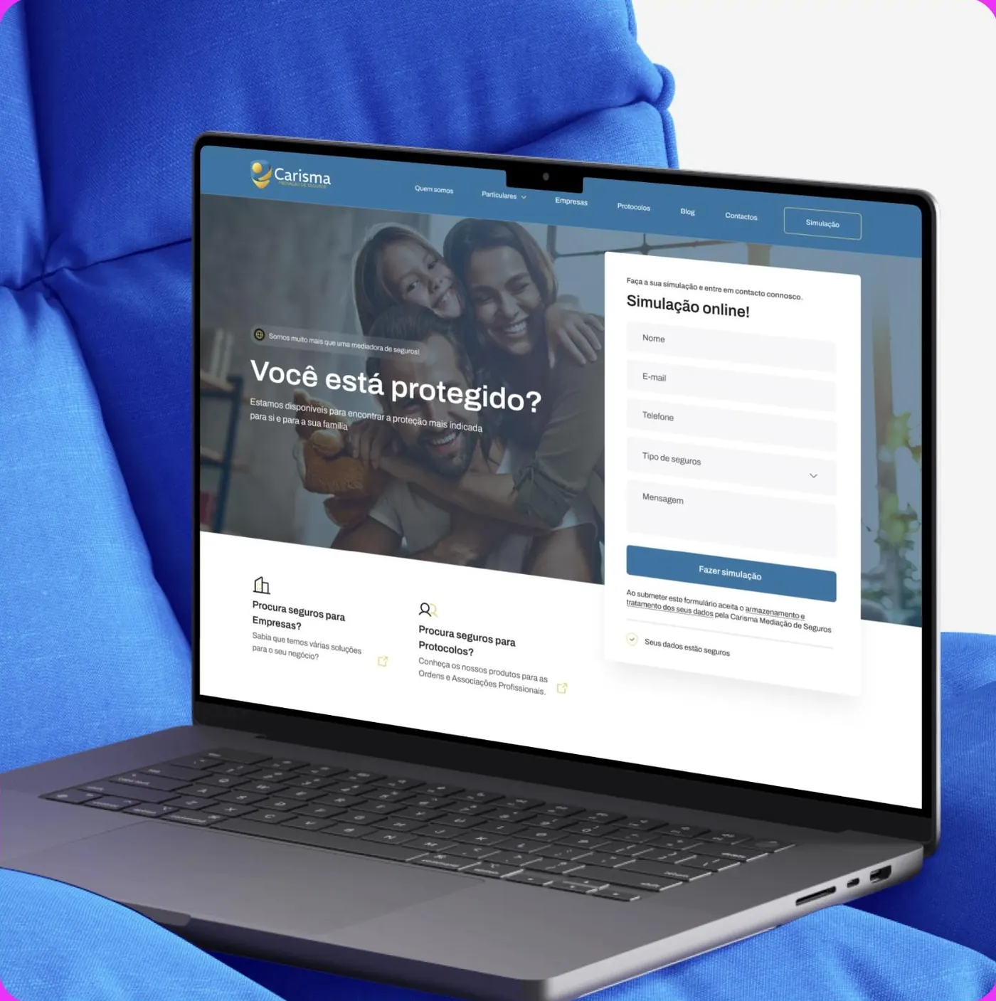
The quote form now sits on the first screen, next to the promise. Name, contact, type of insurance and a note, enough for the team to come back with a proposal straight away.
- The quote visible without scrolling
- Minimal, clear fields
- Every submission with its source recorded

Content that answers before the sale
The blog now answers the questions that stall a decision: what each policy covers, when it moves up a band, what to do when you make a claim. Content that brings in visits and prepares the conversation.
- Topics drawn from real search data
- Baseline technical SEO
- Every article with a destination: the quote
Three decisions, three blocks.
In a sector where almost every site looks the same, the difference lies in answering the right question in the right place, and letting people move forward without friction.
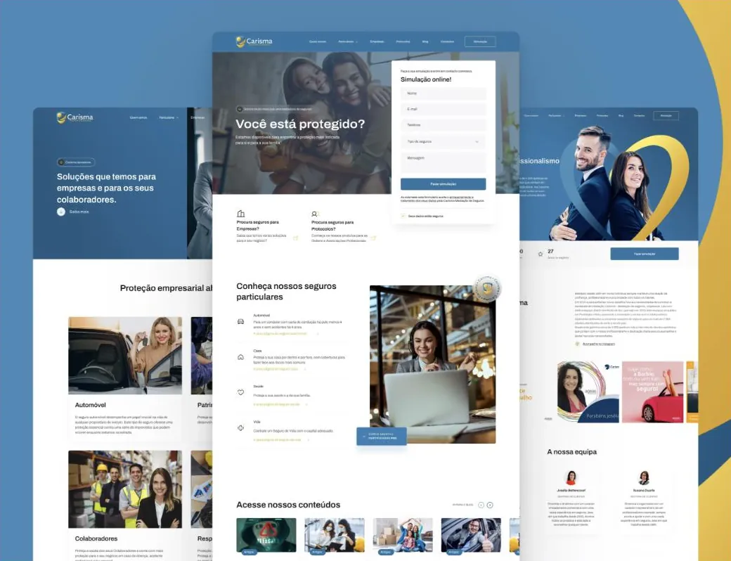
“Which insurance do I need?”
Motor, home, health and life, explained in plain language with a direct path to a quote.
“And for my team?”
A dedicated block for business solutions, fleet and employees, using the same form as on the individuals side.
“Can I trust them?”
A team with faces and roles, partner insurers on show and original content, the proof that replaces the counter.
Blue for trust,
yellow to decide.
Blue carries the sector; yellow carries the action. We used the second one sparingly, only where we want the person to move forward.
What started happening.

- The quote is no longer a phone call
- Anyone who arrives can request a proposal at any hour, with the essentials already filled in.
- The request arrives qualified
- Type of insurance and context come before the first reply.
- We know where they came from
- Every quote now has its source recorded, which makes it possible to decide where to invest.
- Percentages
- We do not publish client numbers without written permission. The ones from this project are discussed on the call, with the data in front of us.
- Premium comparisons
- We do not publish price comparisons between insurers. That is done in the quote, with each person’s real data.
Another case of the same kind.
If your business is good
and stuck offline.
Thirty minutes about what you sell and how you measure. If we are not the right choice, we will tell you straight away.