
Go Tuk
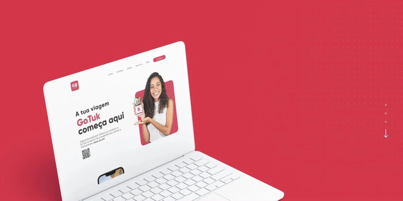
An urban-mobility idea with two audiences at once: people who want to ride and people who want to drive. The site had to speak to both without confusing either.
Two audiences,
one screen.
Go Tuk paired the tradition of Lisbon's tuk-tuks with a booking app. The problem was not the idea, it was explaining it. People looking for a tour wanted to know the price, the route and how to book. People with a tuk-tuk wanted to know how much they would earn and what it took to join.
All of it lived on the same page, mixed together.
- Tourist and driver competing for the same space
- The app download hidden in the middle of the text
- No visual proof of what the tour is like
- Nothing that answered the questions before booking
Two entrances,
one single brand.
Each audience with its own path
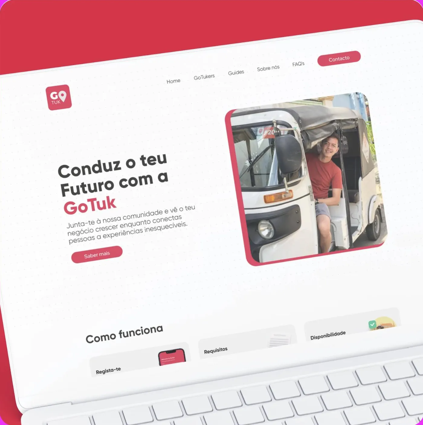
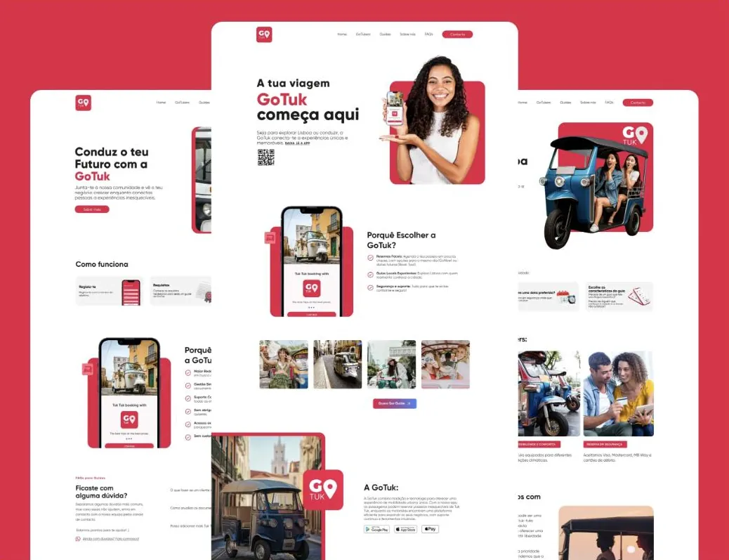
We split the path of those booking from the path of those who want to drive. Two pages, two messages, the same identity. Nobody has to read what does not concern them.
- Passenger route to the app
- Driver route to sign-up
- A menu that does not force a blind choice
From curiosity to download
The download button now sits where the decision happens, not at the bottom of the page. A QR code visible for anyone reading on a computer who will book on their phone.
- QR code and store buttons up front
- The booking steps explained in three lines
- A short form for guide applications
Questions answered before they are asked
We built the FAQ from what the team heard on the phone: prices, duration, what happens if it rains, group size, what a guide does. Each answer shortens the distance to a booking.
- FAQ split by audience
- Technical SEO baseline
- Real photography of the tours and the guides
One brand, two messages.
The same visual system, two readings. The tourist sees a city; the driver sees a business. The colours, the typography and the buttons are the same, what changes is the question each page answers.
“How does this work?”
Book in a few taps, local guides, secure payment. Three reasons, three lines, one button.
“Is it worth joining?”
Higher earnings, simple management, support and no fixed costs. The arguments the team already used on the phone, now written down.
“What if it rains?”
FAQ built from the real questions, so a booking never stalls waiting for an answer.
Lisbon red,
road black.
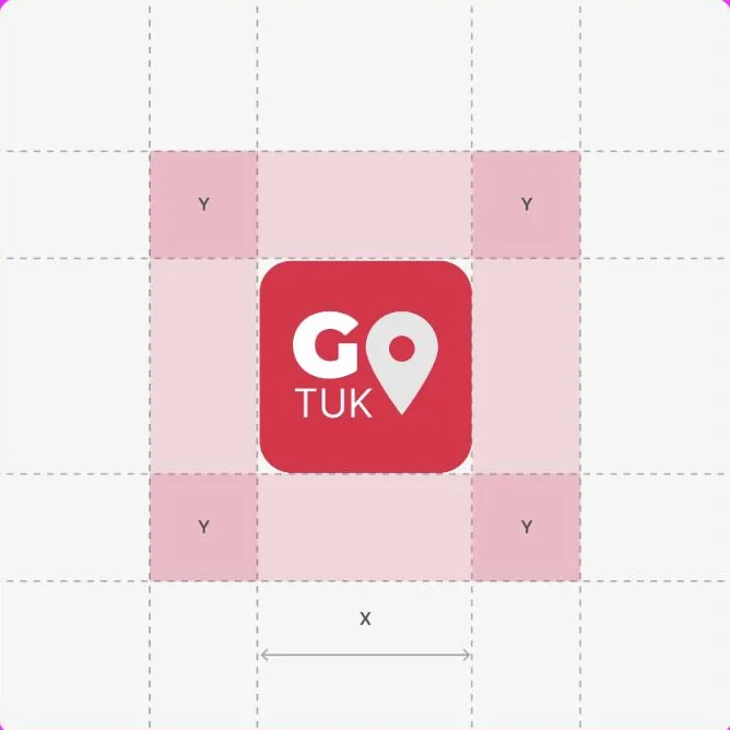
The brand already had the red. Our job was to give it a grid, a typeface with character and rules so it would not get lost between the two audiences.
What started happening.
- The service explains itself
- Visitors work out in seconds whether that page is for them, and what to do next.
- Two conversions, not one
- The app and the guide sign-up now have their own paths, measured separately.
- We know where they came from
- Every download and every application now has its source logged.
- Percentages
- We do not publish client numbers without written permission. The ones from this project are discussed on the call, with the data in front of us.
- Credit that is not ours
- The tour experience belongs to Go Tuk and the guides. We handled the path to it.
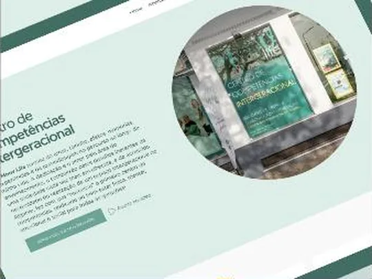
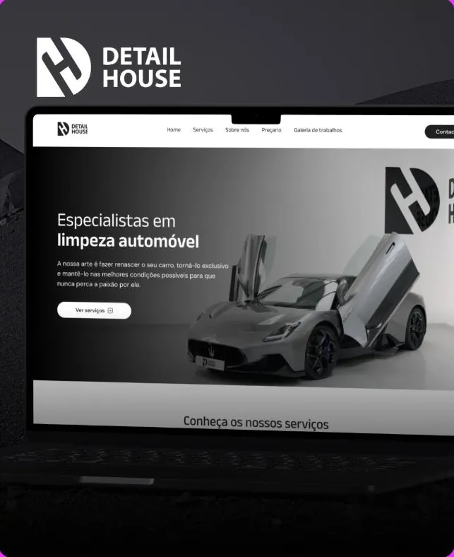
Another case of the same kind.
If your business is good
and stuck offline.
Thirty minutes about what you sell and how you measure. If we are not the right choice, we will tell you straight away.